Report UX Analysis
Enhancing User Experience Through Standardization
I was tasked with redesigning primary reports used at the company. The purpose was to promote standard views of data that are a single source of truth for internal teams and leadership.
Role
UX Designer
Duration
8 Weeks
Tools
Figma
Notion
Power BI
SAP
Team
1 Project Manager
1 UX Designer
1 Power BI Developer
CONTEXT
Power BI aggregates data from systems such as SAP and Excel and presents it in digestible and interactive formats. It is a decision-making tool for internal teams and leadership in the supply chain department at KDP.
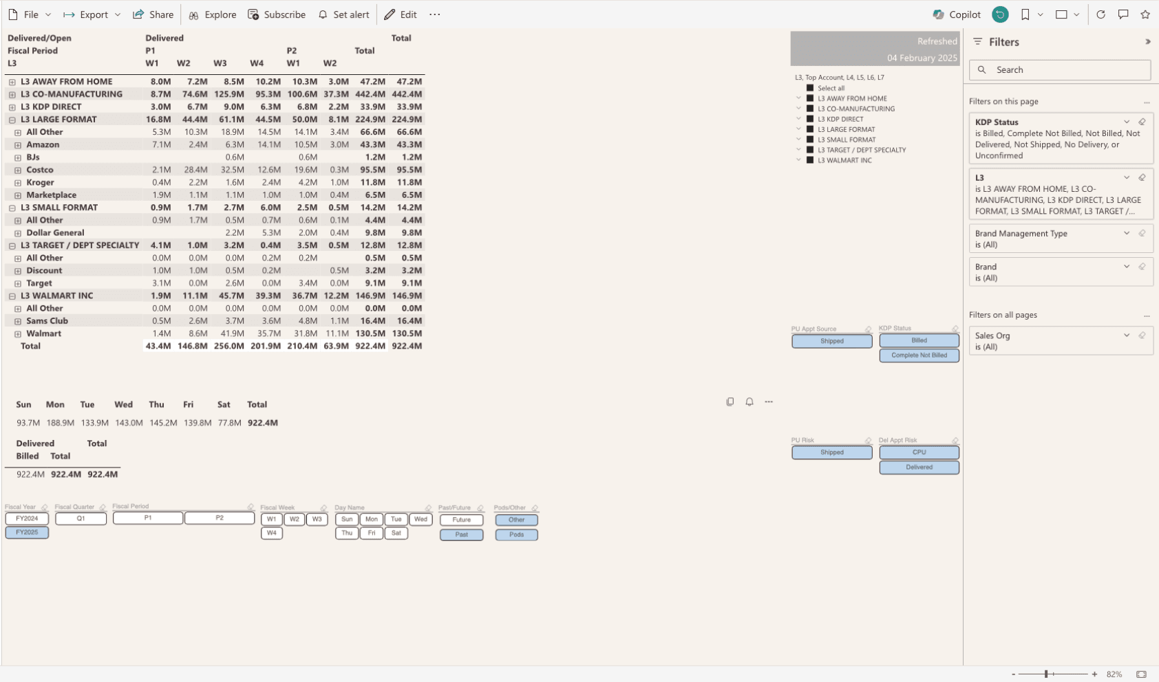
OTI Lite is a primary report created in 2020 used to track operational metrics and monitor key performance indicators such as order timelines and fulfillment rates.
The Current Experience


OTI Lite aims to solve:
Data Fragmentation Across Systems - SAP had lagging or incomplete order visibility. Rider and DHL data weren’t integrated or real time so different teams were referencing different versions of reality.
Manual and Delayed Reporting - The original “OTI” data cube was manually refreshed and led to stale data. There were no digital confirmations of key supply chain events and highly relied on individuals maintaining spreadsheets.
Inability to Align with Customer Expectations - Performance metrics like Fill Rate and OTIF suffered without timely insights.
PROBLEM
What is not working?
OTI Lite still lacks clarity and consistency — leading to misalignment and a fragmented understanding of performance metrics for internal teams and leadership.
RESEARCHING USER GROUPS
User Interviews
I conducted interviews with 8 participants, including existing Power BI report builders and supply chain planners. While I wasn’t able to interview leadership directly, their priorities were relayed by analysts and report builders who work closely with them.
OTI Lite owner / developer: Understand their processes for gathering report requirements, typical business asks, design considerations, report timelines and deadlines, extend of communication with end users and stakeholders.
Supply Chain and Order management Analysts: Understand how OTI Lite is used in daily and weekly execution calls, how order status progression is tracked, key metrics and comparative data points.
Leadership: Understand their interactivity with reports, priority basis metrics, how high-level visibility is defined and OTI Lite’s nature in a presentative and collaborative context.

Findings
The evolving nature of OTI Lite presented a unique set of UX hurdles:
Report information contain redundancies and are fragmented across 11 pages and slicers.
Critical accounts or orders are not effectively surfaced.
Difficulty visualizing day-over-day pacing against goals.
Inconsistent usage of KDP brand guidelines.
User Personas
Based on the collected insights, I created two personas to help guide the design and development strategy.

Taylor
Supply Chain Planner
Analytical
Timeline-focused
Collaborative
Supply Chain
46y
Frisco, TX
Leads daily execution calls coordinating order movement from delivery creation to shipping.
Goals
Ensure orders move efficiently through delivery and shipping stages
Quickly identify and resolve stalled or at-risk orders
Keep all stakeholders aligned during daily logistics calls
Challenges
Interpreting order statuses across multiple systems (SAP, Power BI, etc.)
Inconsistent filtering across views makes trend analysis harder
Status fields not always intuitive or updated in real-time
Needing to manually scan line-by-line data to find issues

Navin
Executive Leader
Decisive
Time-Constrained
Big Picture
Supply Chain
46y
Frisco, TX
Wants visibility into high-level KPIs and operational blockers without digging into detail.
Goals
Quickly understand performance (e.g., CFR, OTIF, Revenue Volume)
Know which teams or accounts are underperforming
Avoid delays that affect customer satisfaction
Challenges
Doesn’t have time to drill into filters or multiple tabs
Frustrated by cluttered or overly detailed dashboards that look unprofessional
Prefers clean summaries with red/yellow/green status indicators
Participates in slowed down conversations in meetings spent trying to understand data
User Adoption Resistance
Skeptical users. 30-year veterans, with a little appetite for restructuring or new technology.
As skeptics, the users I was building for expressed having little appetite for change and processes. This meant that there were even higher stakes and friction with the transition of daily Power BI tools.

‘I don’t see anything wrong here. I’m a numbers guy, so as long as I see numbers, that’s good for me.’
SKETCHES
Iterative Concept Testing
To combat this, I learnt to ask the right questions while presenting visual artifacts as solutions. This helped to better to audiences become more receptive to change.

Low Fidelity Feedback
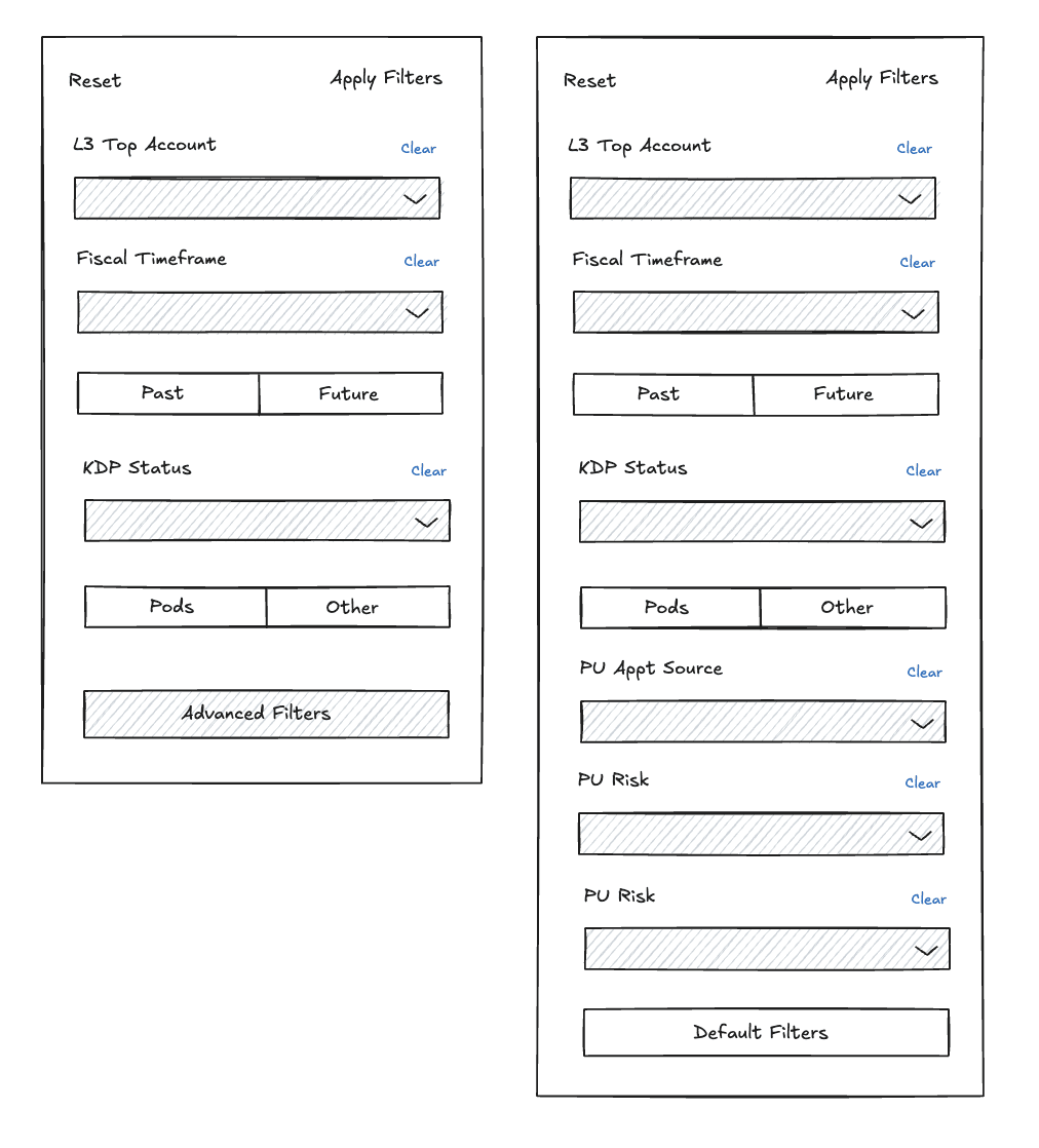
Filteration
Have some way to differentiate the filter section from the rest of the report. Currently, it has the same visual formatting as all other visuals.
Technical Constraints
I had to navigate the niche design capabilities within Power BI for technical feasibility. I referenced external resources that highlighted tried and true best design practices within Power BI to guide me in this process.
I also worked with IT to ensure KDP Font - Mark OT and Poppins were pre-installed on all KDP devices for consistent visibility within Power BI.
DESIGN EXPLORATION

Cavin - I like this but if it could be less wide, too much white space currently. I don’t know how that would fit your overall structure/layout though.
Cavin - If the intention is to click into visuals less, then this one probably makes the most sense.
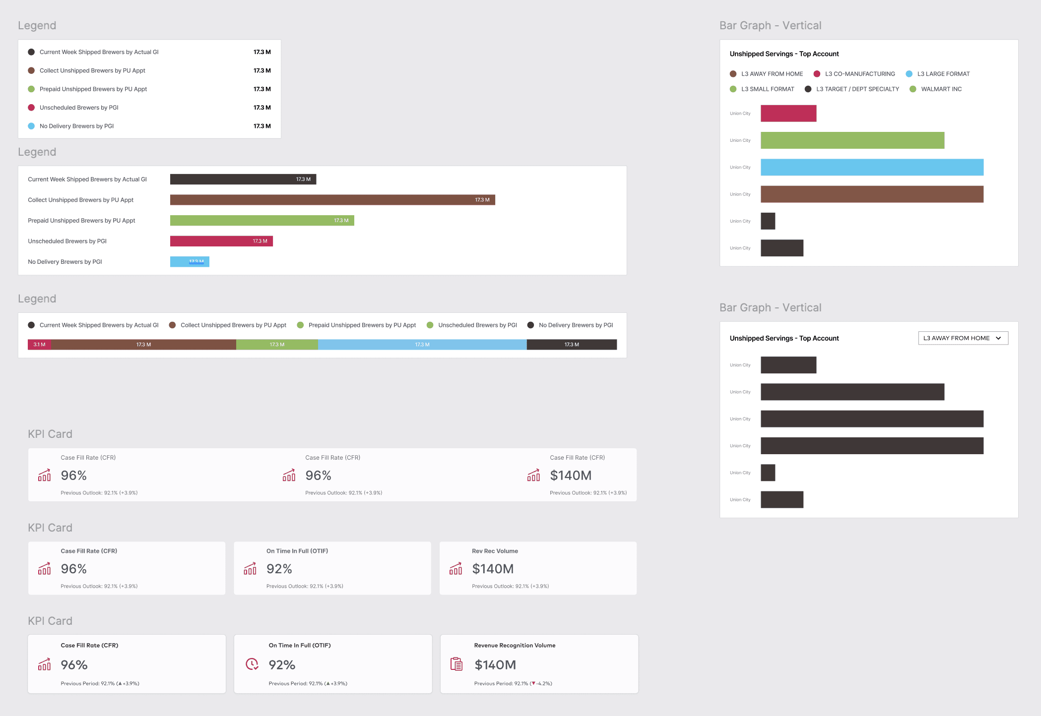
Cavin - I’d rather have unshipped being shown in the same graph, so it’s complete and not segmented. Either don’t use any color but show (Blank), LTL, FTL grouping. This would be more consolidated and only have to compare 2 unshipped graphs vs. 3.
Beverage Pacing by Period
Before
Before
Creates organizational clarity with clear visual hierarchy, familiar icons, & key KPIs for easy performance assessment.
Provides centralized control by consolidating OTI Lite management into 4 dedicated pages, simplifying navigation.
Reduced information overload by cliclet slicer into a condensed filter overlay, grouped in workflow order.
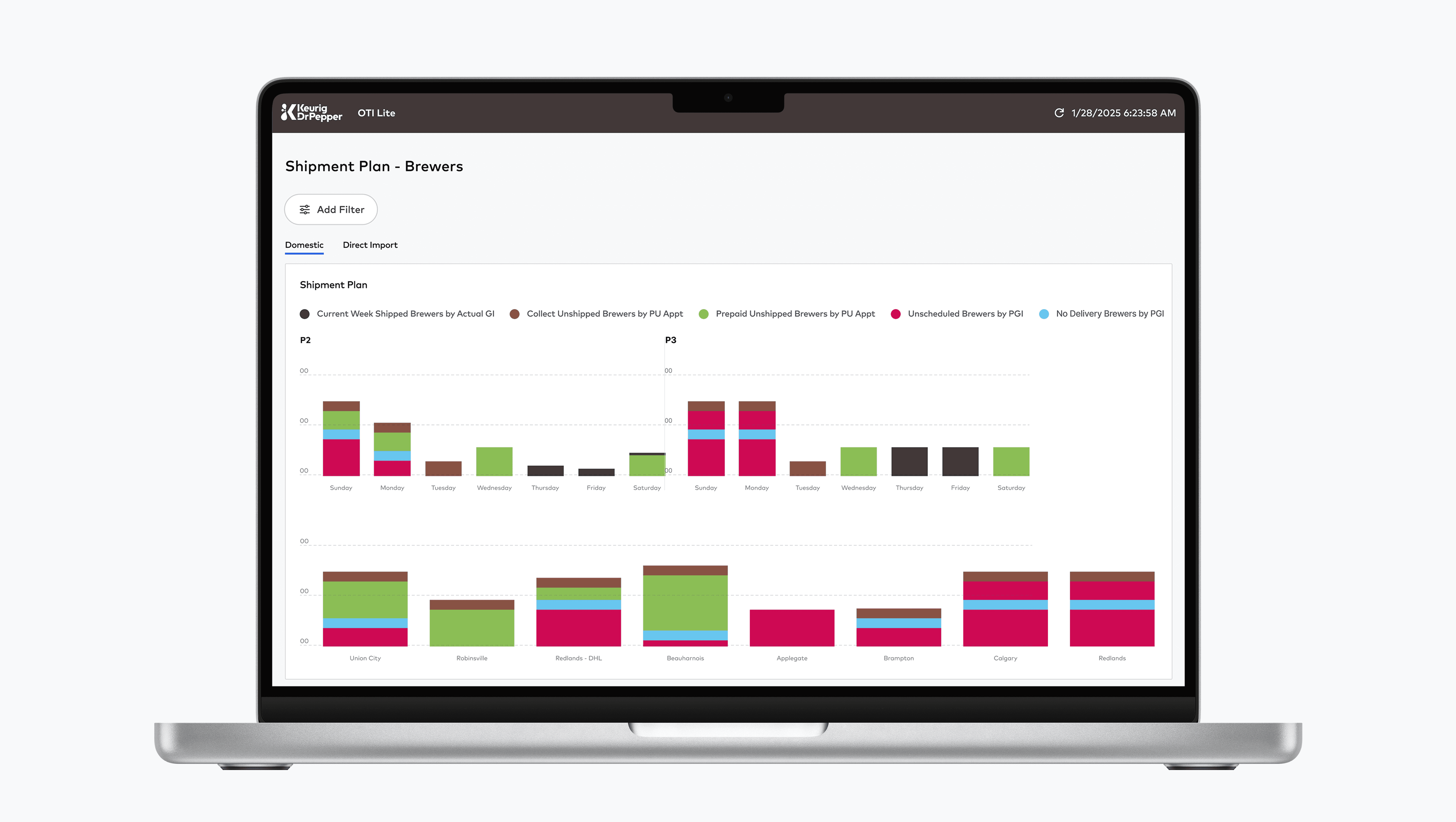
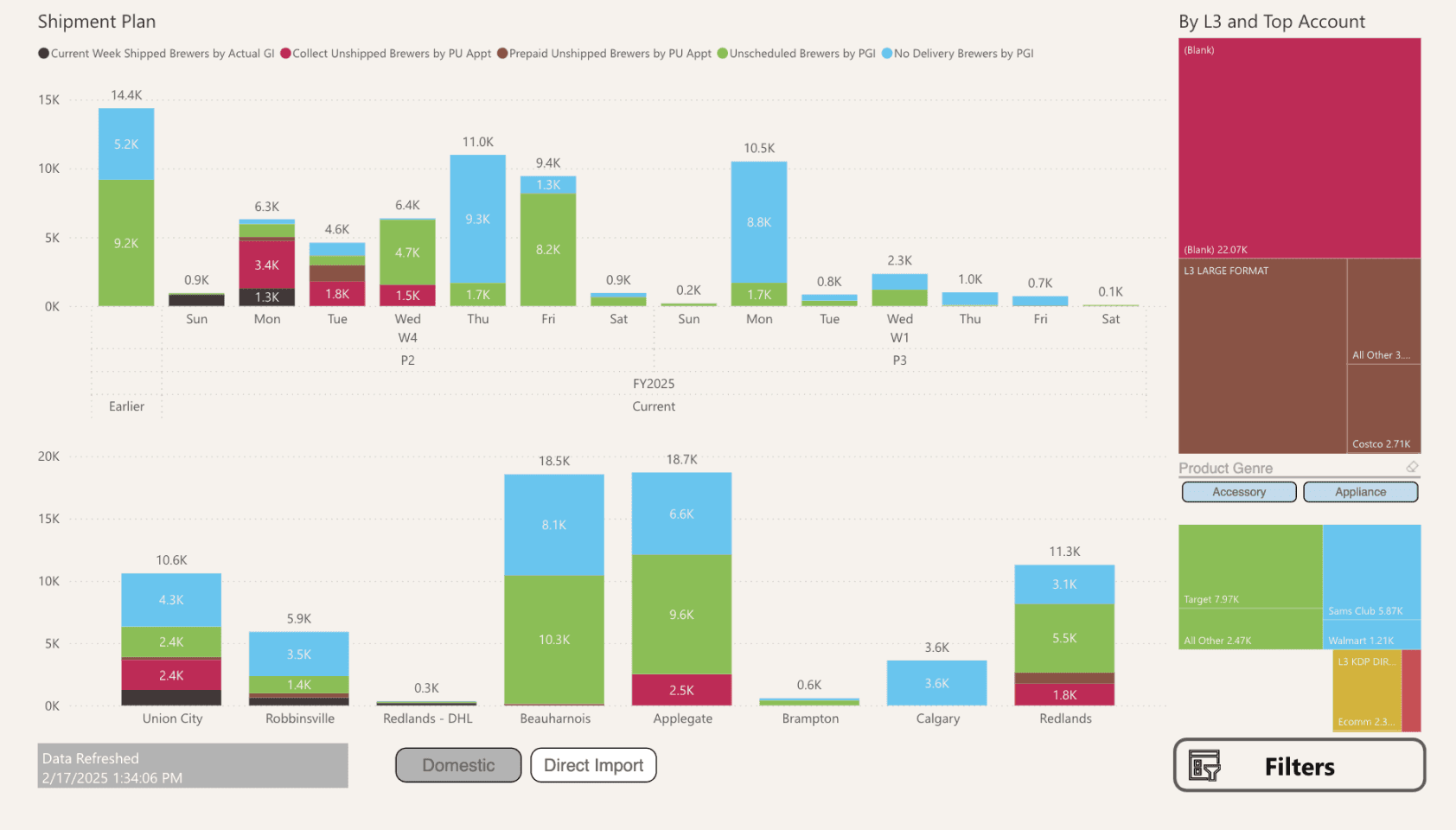
Brewer Pacing by Period
Before

After

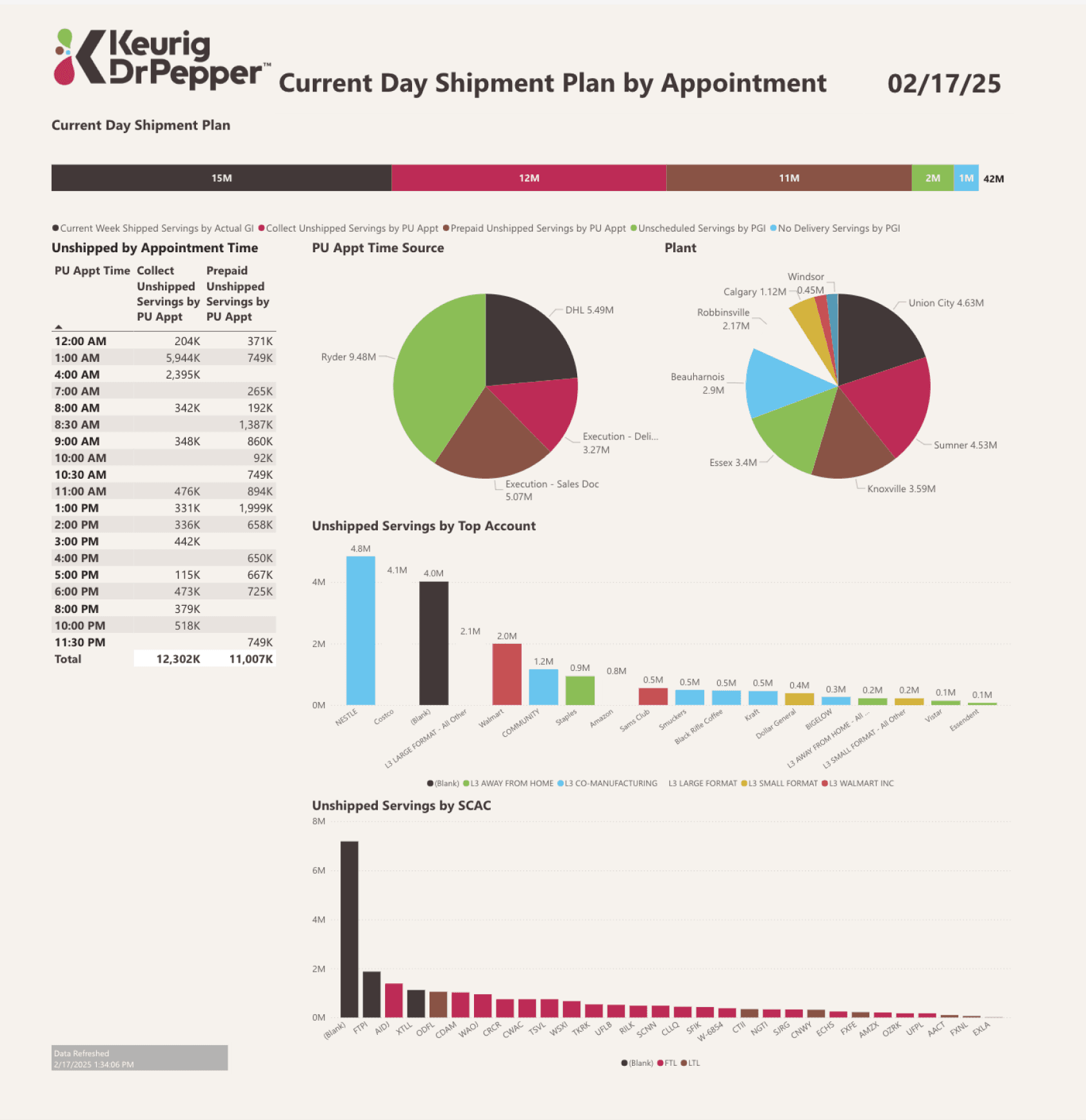
Shipment Plan
Before
After

Provides centralized control by consolidating OTI Lite management into 4 dedicated pages, simplifying navigation.
Creates organizational clarity with clear visual hierarchy, familiar icons, & key KPIs for easy performance assessment.
INTERNAL TEAMS VS. LEADERSHIP
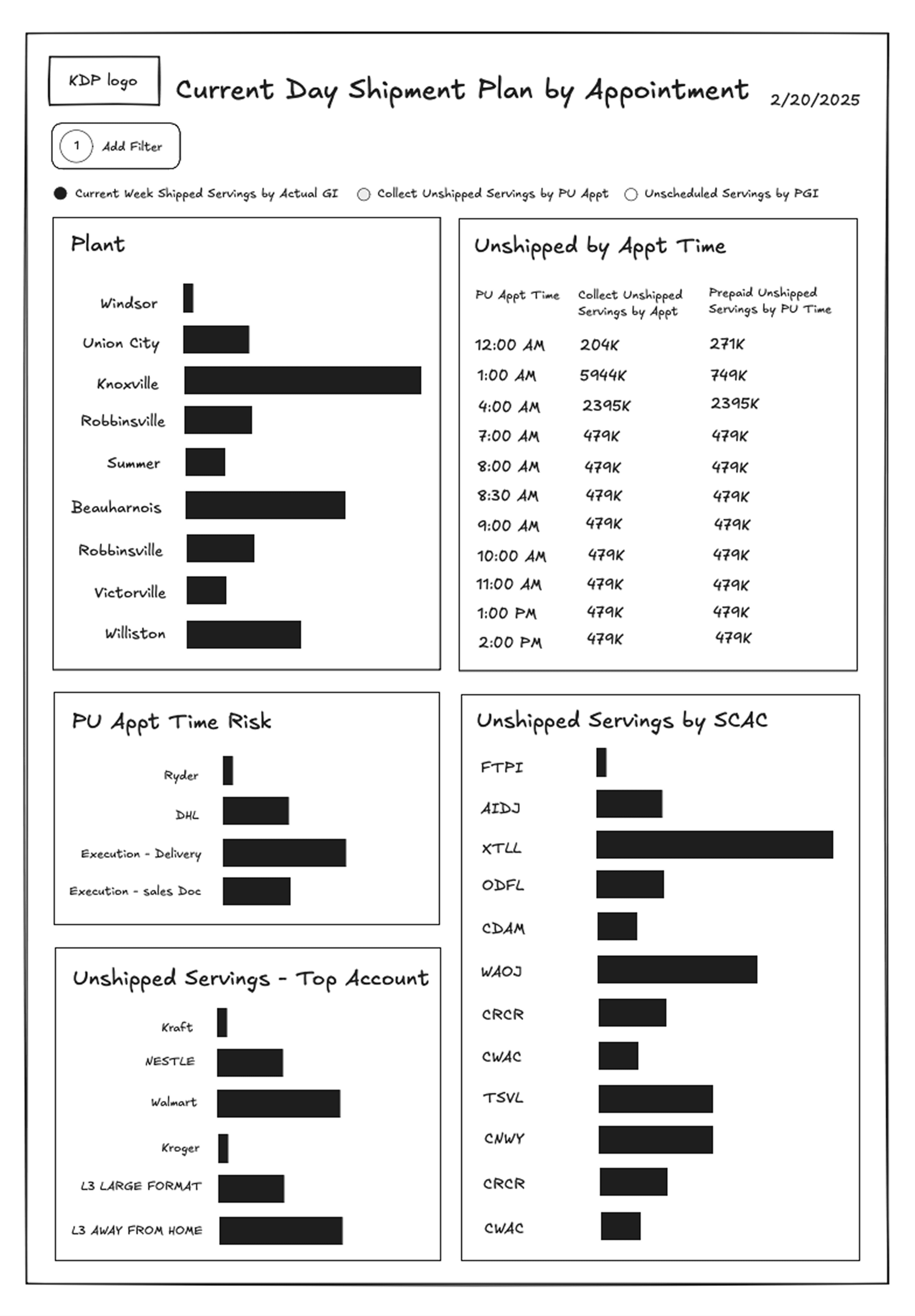
Current Day Shipments
Before
After

Provides centralized control by consolidating OTI Lite management into 4 dedicated pages, simplifying navigation.
Creates organizational clarity with clear visual hierarchy, familiar icons, & key KPIs for easy performance assessment.
RESULTS
Measuring Success
Provides centralized control by consolidating OTI Lite management into 4 dedicated pages, simplifying navigation.
Creates organizational clarity with clear visual hierarchy, familiar icons, & key KPIs for easy performance assessment.
Reduced information overload by cliclet slicer into a condensed filter overlay, grouped in workflow order.
KEY TAKEAWAYS
💭
Design Scrappily
Importance of rapid ideation and agility in a fast-paced environment.
🔍
How to ask the right questions
My focus was on the user, not the technology. I prioritized key features that could enhance the UX alongside navigating user adoption resistance.
⏱️
Embrace ambiguity
As the sole designer, this project taught me the experience of adaptability and reframing in design ownership.
TESTIMONIALS
Congratulations! You did a fantastic job. With this new dashboard now, we have changed the mindset for different stakeholders. We are having more fact-based conversations and moving into action instead of trying to understand the data. So there is a huge saving of time and boosts relationships with different stakeholders with DSD Sales Ops as well. So this is a game changer.
I think the important piece is that a lot of these datasets come together in a time of need. The organization is facing a challenge, we gather this data, we make it right and perfect. But we don’t often have time to put it in a view that puts the user first. So circling back to these longstanding datasets and really freshening up how people interact with them and doing it in agile ways is essential as we go forward. So I really appreciate the work that you were able to do on these big audience taste. DSD Case Cuts is the company's #5 Power BI Report right now. So in terms of user base, it is a substantial number of people going into that report every day and they are seeing the fruits of your work.
PREV.
Pet Health